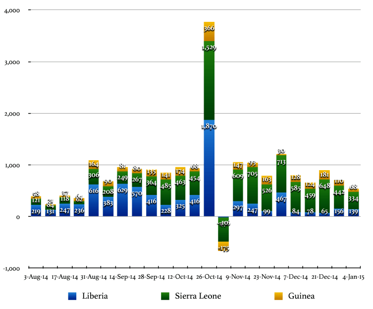
3.2 Weekly New Cases By Country
The stacked bar chart in Figure 8 describes the history of the ongoing Ebola outbreak in the most effected west African countries. The bars represent new case counts presented at weekly intervals. All confirmed, probable, and suspected cases of EVD are included.
The curves in Figure 9 describe the weekly incidence of new cases of Ebola in several west Africa countries. The circles represent the actual incidence data. The smooth curves are polynomial trends fitted to the new case data. All confirmed, probable, and suspected cases of EVD are included.
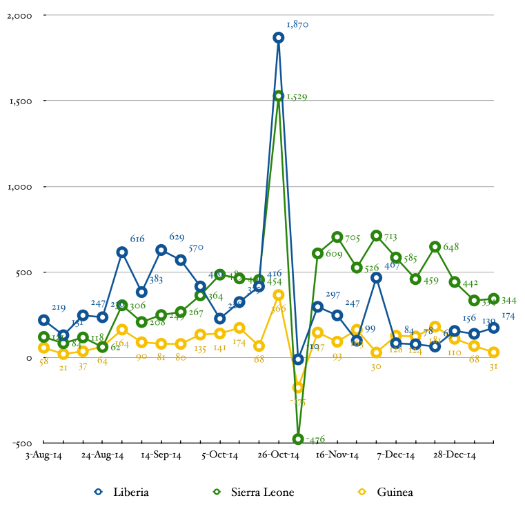
In both charts, the weekly incidence of EVD is computed by subtracting the total number of cases at week n–1 from the number of cases at week n.
Data in this section comprise weekly snapshots from Table 1. Weeks are considered to begin on Monday and end on Sunday, which matches the WHO’s definition of an epidemiological week. Weekly summaries start with the week ending Sunday 3-Aug–14 (epidemiological week 31). The granularity of data available from the World Health Organization precludes the theoretical implementation of this algorithm (i.e. WHO data is not always published on Sundays). Therefore, the algorithm is implemented in practice by displaying the final data released during each epidemiological week. This procedure will skew the linearity of the time axes slightly.