2 Overall Scope of the Outbreak
The charts presented in this section aggregate incidence data from countries Liberia, Sierra Leone, and Guinea during the current west African Ebola outbreak. They provide an indication of the overall impact of the disease.
The charts consist of weekly snapshots of data from Table 1. Weeks are considered to begin on Monday and end on Sunday, which matches the WHO’s definition of an epidemiological week. Weekly summaries start with the week ending Sunday 3-Aug-14 (epidemiological week 31). The granularity of data available from the World Health Organization precludes the theoretical implementation of this algorithm (i.e. WHO data is not always published on Sundays). Therefore, the algorithm is implemented in practice by displaying the final data released during each epidemiological week. This procedure will skew the linearity of the time axes slightly.
Data from Table 2 and Table 3 (countries with localized or inactive transmission – Nigeria, Senegal, the United States, the United Kingdom, Spain, and Mali) are not included in these charts. Currently, their disease counts are dwarfed by the incidence of the disease in countries with widespread transmission. Should the situation change the charts will be updated accordingly.
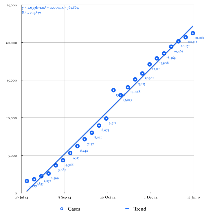
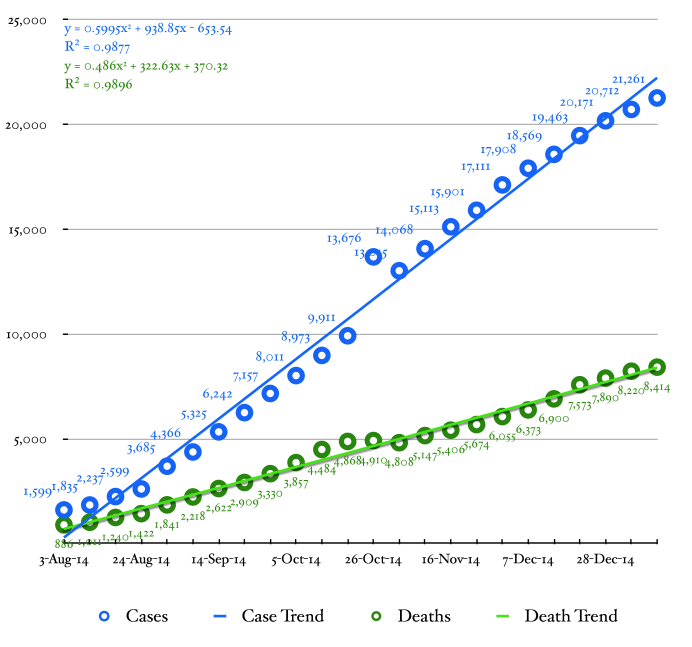
The primary curve in Figure 1 describes the cumulative history of all confirmed, probable, and suspected cases of Ebola west African countries with widespread transmissionduring the current outbreak. The circles represent data points from Table 1 (eighth column). The smooth curve is a polynomial trend fitted to the cumulative case data.
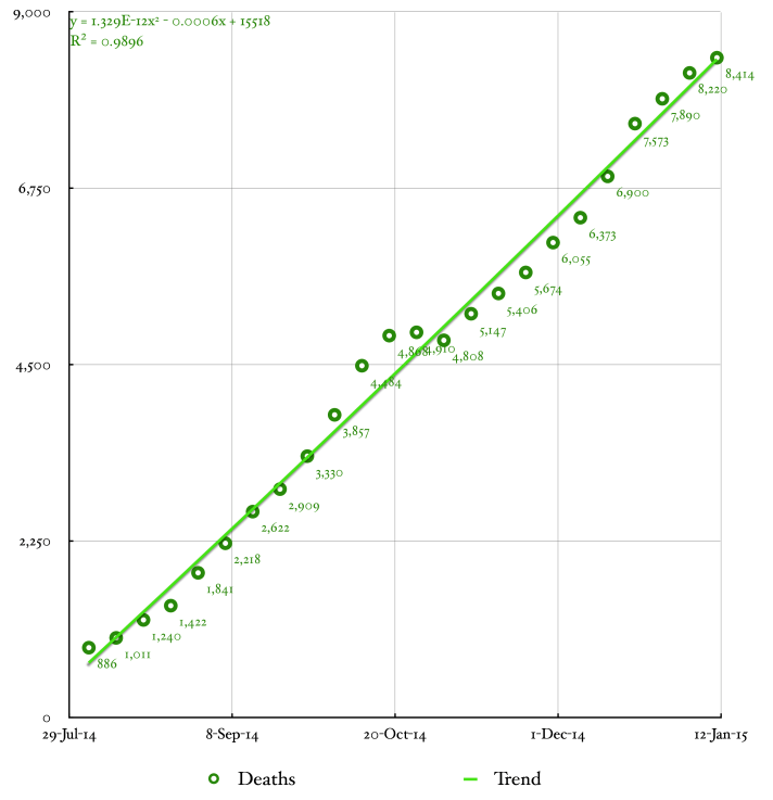
The primary curve in Figure 2 describes the cumulative history of all confirmed, probable, and suspected deaths from EVD in west Africa during the current outbreak. The circles represent data points from Table 1 (ninth column). The smooth curve is a polynomial trend fitted to the cumulative death data.
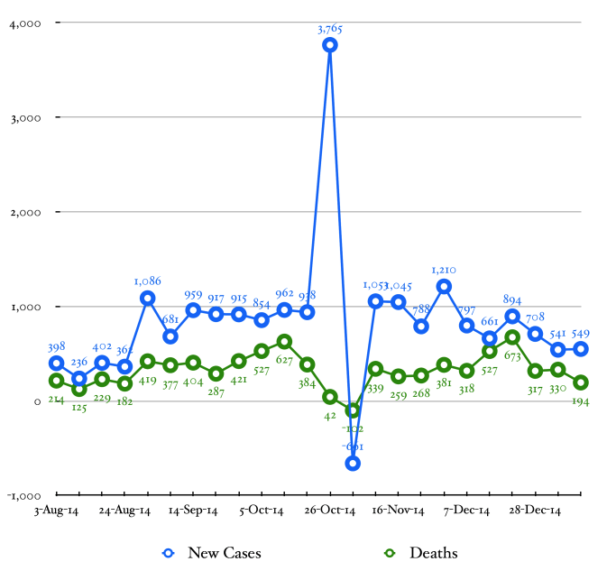
The blue curve in Figure 4 describes the weekly incidence of new cases of Ebola in Liberia, Sierra Leone, and Guinea. The weekly incidence of EVD is computed by subtracting the total number of cases at week n-1 from the number of cases at week n.
The green curve in Figure 4 is the number deaths reported from EVD in west Africa during each week of the current outbreak. The weekly deaths attributed to EVD are computed by subtracting the total number of deaths at week n-1 from the number of deaths at week n.